


“Risk” is two-sided: the risk of gain & the risk of loss. Long-term investors want the minimize the risk of loss and maximize the up-side risk.
Typical measures of risk, like standard deviation, are not sufficient at distinguishing the upside risk from downside risk.
Measurements that capture the “left tail” like semi-standard deviation, Value-at-Risk measurements like VaR and CVaR are better but not enough
How Much Risk is in Your Benchmark?
To answer this question, we must first measure risk, which is no easy task.
In our blog we explore various aspects of the risk and return profile of key benchmark portfolios. After all, not having a benchmark is like trying to measure without a yardstick.
Remember, the most popular benchmarks are simple equity bond splits represented in percentages. For example, a 60/40 benchmark is 60% equity and 40% fixed-income, but that is not enough information to truly understand the risk in the benchmark portfolio.
In this post, we focus on measuring risk.
As academics and financial professionals we are taught to measure risk with the standard deviation (a.k.a. volatility) of returns. Remember that the standard deviation is designed to track the deviations of returns from their average. Those deviations might be lower or higher than the average. Let me repeat: they may be higher than the average. That doesn’t feel like risk. Risk is supposed to be “bad”. Risk is supposed to be associated with a loss.
Looking at this figure of S&P 500 annual returns, we can see the difference between “good” and “bad” volatility. The figure plots the rolling one year holding period returns for the S&P 500¹ along with the average S&P 500 return during that time period. We call anything below the red line, “bad” volatility as we don’t want too much movement below the mean return. Anything above the red line is considered “good” volatility.
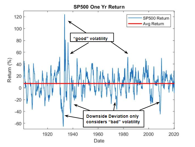
There are a few statistical tools that can improve our measure of risk. One is the semi-standard deviation, which captures the downside deviation by computing the volatility using only returns that fall below the red line.
The table below reports both measures of risk, standard deviation and semi-standard deviation, for a few key stock/bond benchmark portfolios. We proxy the equity portion of our portfolios with the IVV ETF² and the bond portion with the TLT ETF³. We will focus on the rolling one year holding period returns for all allocations⁴.
| Equity/Bond | 100/0 | 80/20 | 60/40 | 40/60 | 20/80 | 0/100 |
| Standard Dev. | 15% | 11% | 8% | 7% | 9% | 11% |
| Semi Standard Dev. | 67% | 34% | 13% | 3% | 3% | 14% |
Going from left to right across the columns of the table, the standard deviation tells the typical story: equities are the most risky; as we mix with bonds there is a sweet spot that improves the risk return tradeoff; as we move beyond that mix, risk rises.
This story holds for the semi-standard deviation. However, another critical storyline reveals itself when comparing the first and second rows of the table. Asset allocation impacts downside risk much more dramatically than the standard deviation might lead you to believe.
Compare the 100/0 to the 80/20 portfolio. The standard deviation drops by 13%. Meanwhile, semi-standard deviation drops by 50%. Now compare the 100/0 (all-stock) to the 0/100 (all-bond) portfolio. The standard deviation drops by 27%, while the semi-standard deviation drops by 80%.
Risk, as we conventionally think of it, is understated by standard deviation. To get an even better idea of the riskiness of a portfolio, we recommend looking at the entire portfolio distribution of returns.
This figure plots the histogram of one year returns for a variety of equity/bond allocations. We can “see” the risk in the left tail. Observations occurring in this region are the returns we think of as risky. The larger the size of the tail, the more frequent are those losses, and hence the greater the risk.
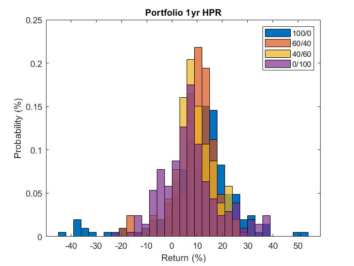
Not surprisingly, the all-stock (100/0) portfolio has the largest left tail, with losses ranging as large as -45% during our sample. As we reduce the stock weighting that left tail shrinks, just as we saw with the semi standard deviation in the table above.
We usually measure the size of that left tail in two ways. First, the Value at Risk (VaR) can be interpreted as the calculated worst-case loss scenario with a 95% confidence level for any one year holding period. Or more simply, it’s where the left tail starts. Second, the Conditional Value at Risk (CVaR) can be thought of as the size of the loss if you are in the left tail.
The table below shows the calculated VaR and CVaR over the full sample for each equity/bond mix. For the all-stock (100/0) portfolio, 95% of the returns observed have returns better than -20%, and during those terrible periods when we did have losses that big, they averaged -34%. Meanwhile, the left tail for the all-bond (0/100) starts at a gain of 9%. If losses do occur, then are typically as large as -14%.
| Equity/Bond | 100/0 | 80/20 | 60/40 | 40/60 | 20/80 | 0/100 |
| VaR | -20% | -15% | -9% | -3% | -4% | 9% |
| CVAR | -34% | -25% | -18% | -8% | -8% | -14% |
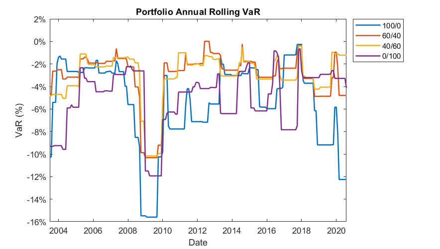
The figure below plots the annual rolling VaR for a number of different equity/bond splits. We can see the 100% equity portfolio has the largest VaR during most of the sample period, whereas the portfolios mixed with bonds have smaller VaR values.
However, it is critical to notice that risk is time varying. Consider just the last four years. There was a time in early 2017 where an all-stock portfolio had the smallest left tail risk and the all-bond portfolio had the largest. Looking at the recent Covid bear market, bonds provided the more typical downside protection, but the interplay between stocks and bonds within the 40/60 portfolio actually generated an even lower amount of risk
The bottom line is that knowing your benchmark means understanding risk. Understanding risk means moving beyond simple measures like standard deviation.
Dr. Anessa Custovic, PhD
¹S&P 500 price index data is taken from Multpl.com and FRED and then combined into a larger data set that spans from January 1900 – June 2020. Annual holding period returns are computed from monthly data and rolled forward.
²The IVV ETF tracks the S&P 500 index and is thus a good proxy for equity returns. Monthly price data for IVV is from Yahoo Finance.
³The TLT ETF tracks the Barclays 20+ Yr Treasury Bond index and is thus a good proxy for long term bond returns. Monthly price data for TLT is from Yahoo Finance.
⁴Rolling one year holding period returns are computed from monthly simple returns of IVV and TLT. We compute simple returns from adjusted close prices, which take dividends and stock splits into account. The data spans from July 2002 – August 2020.